

When I started building startups, I quickly realized the importance of wireframing, prototyping, and keeping things simple. At the begging I was thinking that it was just a jargon and and some kind of fluff. But it turned out that these steps aren’t just technical—they’re the foundation of creating products that people actually want.
Wireframing is your blueprint—it aligns your thoughts, your team and saves time. Prototyping helps you test fast and fail faster. And design? It’s all about making the experience seamless for your users.
Here’s what I’ve learned along the way:
• Start simple. Iterate often.
• Always design with your users in mind.
• Never skip testing—it’s your safety net.
Whether you’re sketching on paper or using fancy tools like Figma or Adobe Suite, it’s all about getting your idea out there and making it better, step by step.
Developing Product Vision
Having a clear vision of the product – a picture of it in your mind that you can articulate clearly to other people who develop the product with you – is important for you as the founder of a startup. What makes you a leader of a startup is your ability to see what others don’t see. You can envision a product that solves a problem. How you describe it (the “picture” in your mind) will affect the way the product developers around you act and react.
Just as thinking changes and morphs in everyday life, your vision of the product will evolve over time as new information comes to light, but when you are charting the direction of your startup, you need to be able to tell the difference between your vision of the product and a hallucination. Distinguishing between the two can save you trouble in the early stages of your startup.

In a startup, once you have developed and articulated the product vision that guides the developmental work, something we refer to as “hallucinations” will tempt you to continuously be changing the product vision every time you get a new piece of information.
You may go to talk to a prospective customer, hear an interesting piece of feedback and then come back to your team at the startup all excited, saying, “We need to change the product. I have figured it out. We need to develop the product in this totally new direction.”
As a result, everyone working with you stops what they are doing; and your startup loses time and money, upending the product development team – all based on one piece of feedback from a prospect. This is likely a hallucination, which enticed you.
You have not done any brainstorming or testing about the new idea. You have not conferred with trusted advisors. You have not relooked at your commitment to the product vision you had methodically developed. Instead, you chased the “shiny object” of an enticing idea.
You demanded a pivot, but before sending the product team down the proverbial rabbit hole, you did not validate whether the new direction is better than the product vision you already had. It is possible that your familiarity with your own product vision may make it seem like other ideas are more “exciting” in the moment simply because they are new and seem trendy.
The worst part is that you could chase these hallucinations on a regular basis. You could get a new “bright idea” every month and think you have solved your startup’s product-market fit woes. It may feel nice to believe you have figured out the puzzle of your startup’s product development, but it can also result in your staff being afraid to make any decisions and even engineers wanting to leave your startup. You don’t want to continually be sending your startup into “fire-drill mode,” abandoning your agile development process and prompting the product team to be erratically pivoting in pursuit of your “hallucination of the month,” as if they are trying a new ice cream flavor of the month. You don’t want your startup meltdown under such conditions that you would be directly responsible for creating.

To avoid allowing hallucinations to wreak havoc in your startup, I recommend that you do the following three things when new information comes to you, threatening to disrupt your true product vision:
Take a few days to think about it. Allow the initial excitement to wear off.
Analyze it privately and objectively with someone whom you trust
After you have brainstormed about it with a trusted advisor, invite open feedback from co-founders or the product development team and create a way to test the new idea before upending the team’s current efforts
If you are going to make a substantial change to your product, it should be part of a coherent strategy, not because of lack of self-control, insecurity or enticements by hallucinations. Too much is at stake. As the leader of a startup, you do yourself a favor by holding yourself to a higher standard and staying true to your product vision unless you are able to test and validate a pivot that is truly worthwhile.
Wireframing for Technology
Wireframing is a mock-up or layout of digital interfaces that will exist on a site, including content and functionality aligned to user needs. It is like a blueprint for design. It helps conceptualize the application before building the product. It’s a visual guide to the framework of your product.
Especially at a startup stage, wireframing gets the team on the same page, considering the contents, structure, hierarchy and functionality that will affect user behavior with the product. Everyone who is involved in the development of a product uses and benefits from wireframes, ranging from engineers and UX designers to executives, partners, graphic designers and information architects.

Principles of Wireframing
The following are commonly accepted principles of wireframing:
Understand who will use the product and what need the product is meeting
Set expectations, not only goals
Everything in the wireframe needs to have a meaning
Use a consistent approach, such as the same design language
Start small, evolve it rapidly and iterate it widely
There is a trade-off for every decision made in the wireframe
Presenting your content in the wireframe in a way that seems “familiar” to users should be a main concern of yours at this point. Before you ever build the actual product, the wireframe shows how users will be able to do what they want to do faster, better, easier, etc. The wireframe saves you time and money because you will be able to figure out things and think through things before you build the product and test it.

As you are doing the wireframing, you should also set expectations about the design process and what is involved. One of the best practices is to emphasize SMART goals. The term “SMART” is an acronym that stands for:
Specific
Measurable
Achievable
Realistic
Timely
This SMART approach to product development will help you break down the heady challenge of building a product into doable pieces. You will be able to reduce the vagueness and uncertainty away from unachievable goals. Your wireframe will be realistic, which means it will not promise to do everything for everyone. Less is more. Lastly, you are time-bound, so the process does not drag on forever.
Stay simple, stay simple, stay simple! Remember that everything has a meaning, and it should be focused on solving the user’s problem and giving them a great experience.
Rapid Prototyping
A prototype is an early release or model of a product meant to be tested. Rapid prototyping is a design workflow that includes coming up with new ideas, prototyping and testing. This form of prototyping is done very, very fast in order to save time and effort, helping you rapidly discover and validate the best ideas, reducing the risk of you building a product that no one wants. By prototyping and testing fast, you can get rid of the bad ideas and focus on the good ones. Considering the stage where you are with your startup idea, it is in your best interest to build a prototype as early as possible so that you can begin to test and validate your concept with potential customers and users.
It is highly recommended that you do not reveal to customers that the product is a prototype. They should think they are interacting with a “real” product. If they get stuck on the fact that it is a prototype, they may not give authentic reactions. However, you may be able to find some early adopters who are eager to try out the prototype, as beta testers, and ultimately provide you with crucial feedback on how to optimize your offering. Don’t forget to build a relationship with people who are beta testing your prototype for they may become some of your earliest customers, even if you are still at the prototype or MVP stage.

Different types of rapid prototyping
There are three different kinds of prototyping for you to keep in mind as you consider the next steps for manifesting your idea into the physical world. The term “fidelity” as mentioned below refers to how closely a prototype matches the final product.
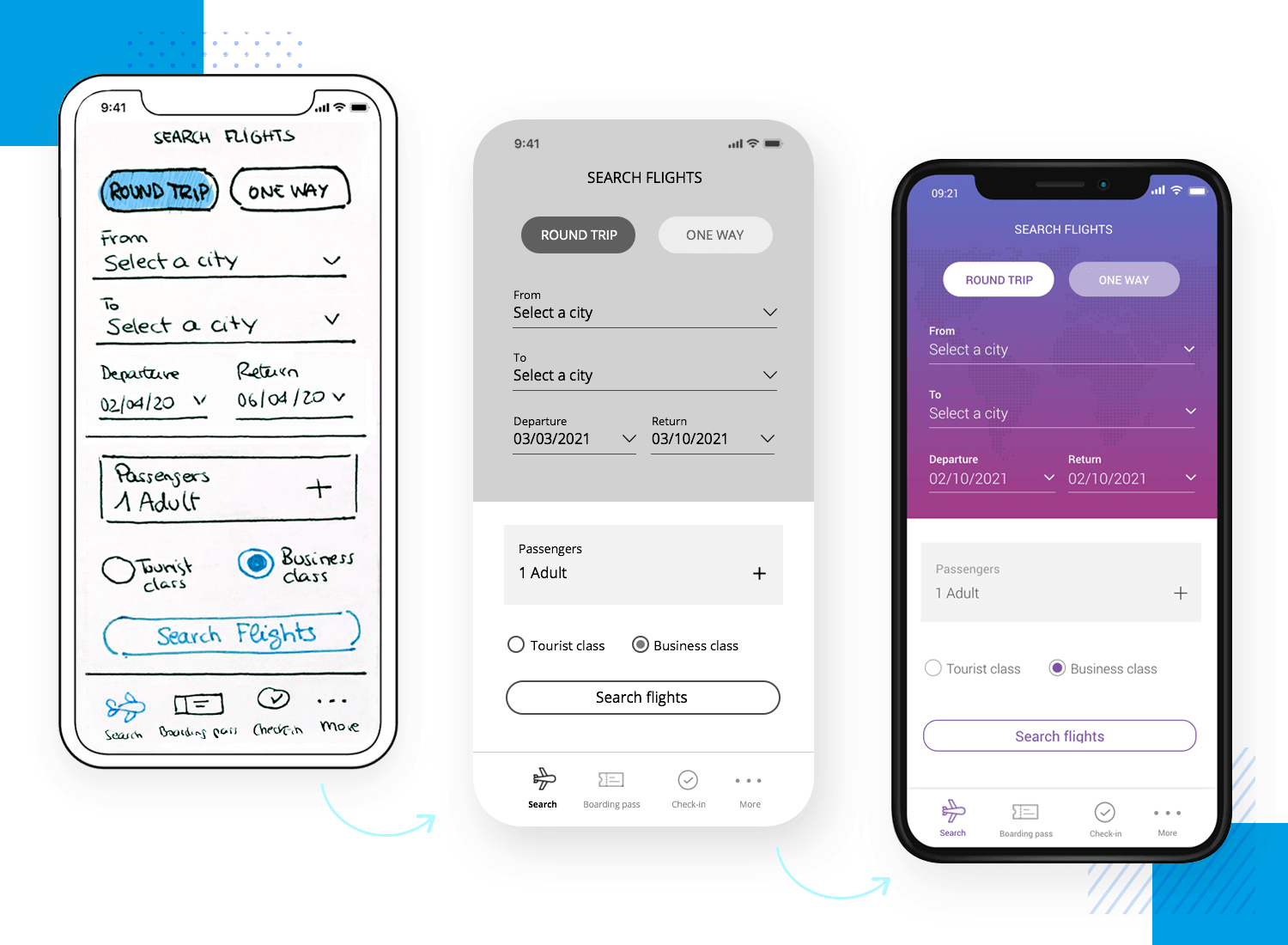
A Low fidelity prototype uses static, pencil-and-paper sketching – other than using your creativity, this is the simplest and fastest way to convey your idea without investing too much time or money
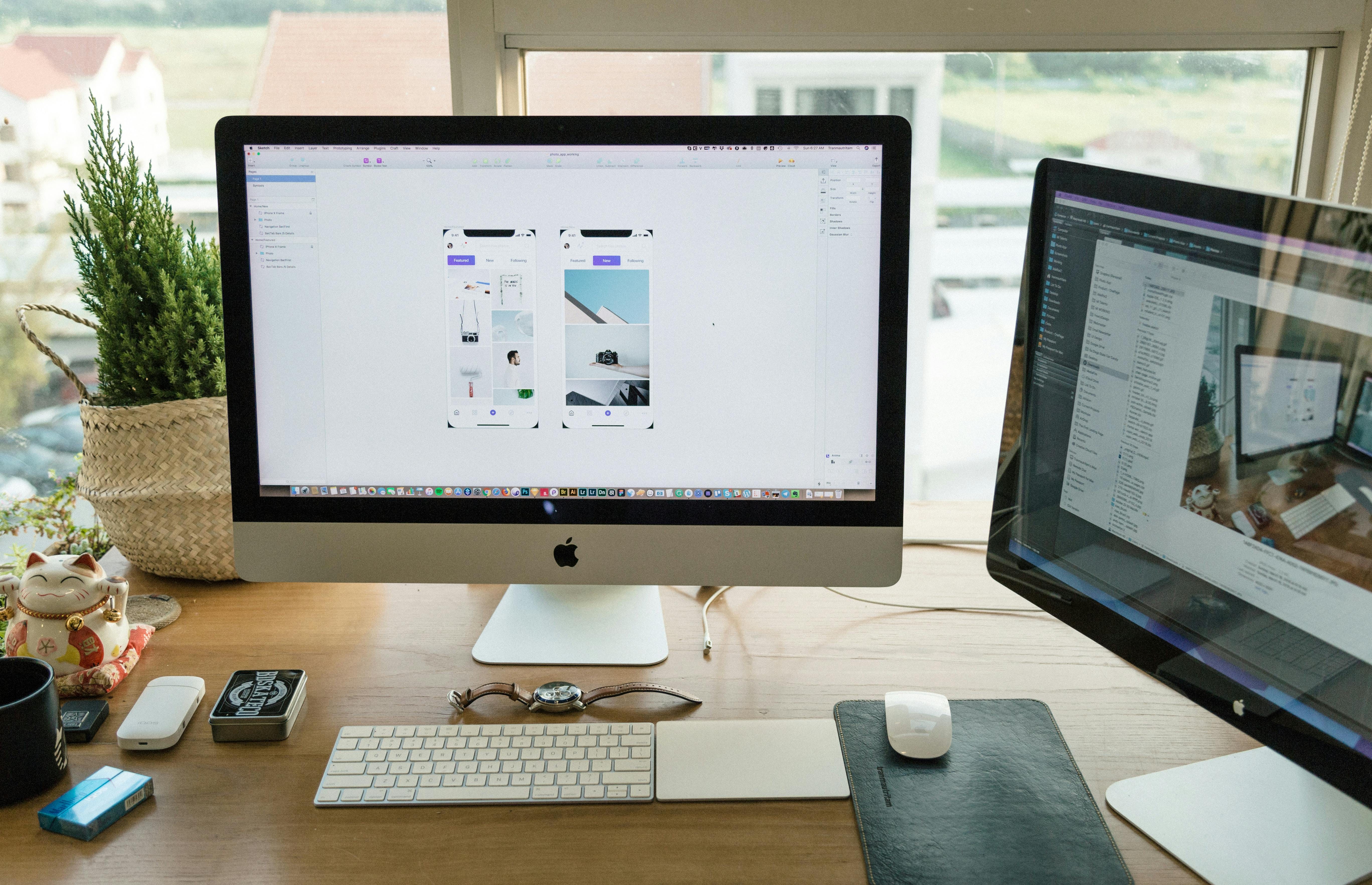
A Medium fidelity prototype uses computerized tools to produce prototypes in the form of wireframes and workflows – this second method is becoming far more popular among tech, web, and app based offerings since there are many resources that allow you easily create a mockup of your idea. Some tools you can use in this range include Figma, Canva, Balsamiq, Sketch, Framer X, Moqups, Adobe Illustrator, InDesign, or Photoshop, etc.
A High fidelity makes the prototype so realistic that it looks like the final product. If you’re building a website or an app, then this is the final prototype with a realistic and working interface. If you’re building a tangible or physical product, you may consider using a 3D printer to create a miniaturized version of your product (if it’s a large concept, like a flying car or a space ship!) or simply create the prototype as it would be sold to the customer if you are selling something like shampoo, dresses, or even chocolate.
Pros and cons exist for each. For example, high fidelity could take up too much time, while low fidelity could be too basic. You need to evaluate what would work best for you. The image below shows an example of an app concept iterated through low, medium, and high fidelity prototypes.
You also need to take into consideration three aspects of a prototype’s fidelity:
Visual
Functional
Content
The point here is that you want the customer to focus on providing feedback about the functionality. You don’t want to distract them by the visual. And it’s fine to add real content later (dummy text is usually fine at the very beginning). Just remember to prototype as early as possible so that you can at least manifest your idea into the real world and start gathering feedback. Also, you don’t have to spend a fortune on building a prototype, especially if you are designing a web or app based tool. However, if you are building a physical, tangible product, like a better ice chest, or clothing, or something that will require actual materials, think critically about how much you should budget and focus on developing a solid medium fidelity prototype that will allow you to pitch and demonstrate your idea to potential friends, family, and external investors in the coming weeks and months. I recommend you spend some time working through your first iteration of the low fidelity prototype. If you already did that, then focus on the next level of prototyping.
UX Design Principles
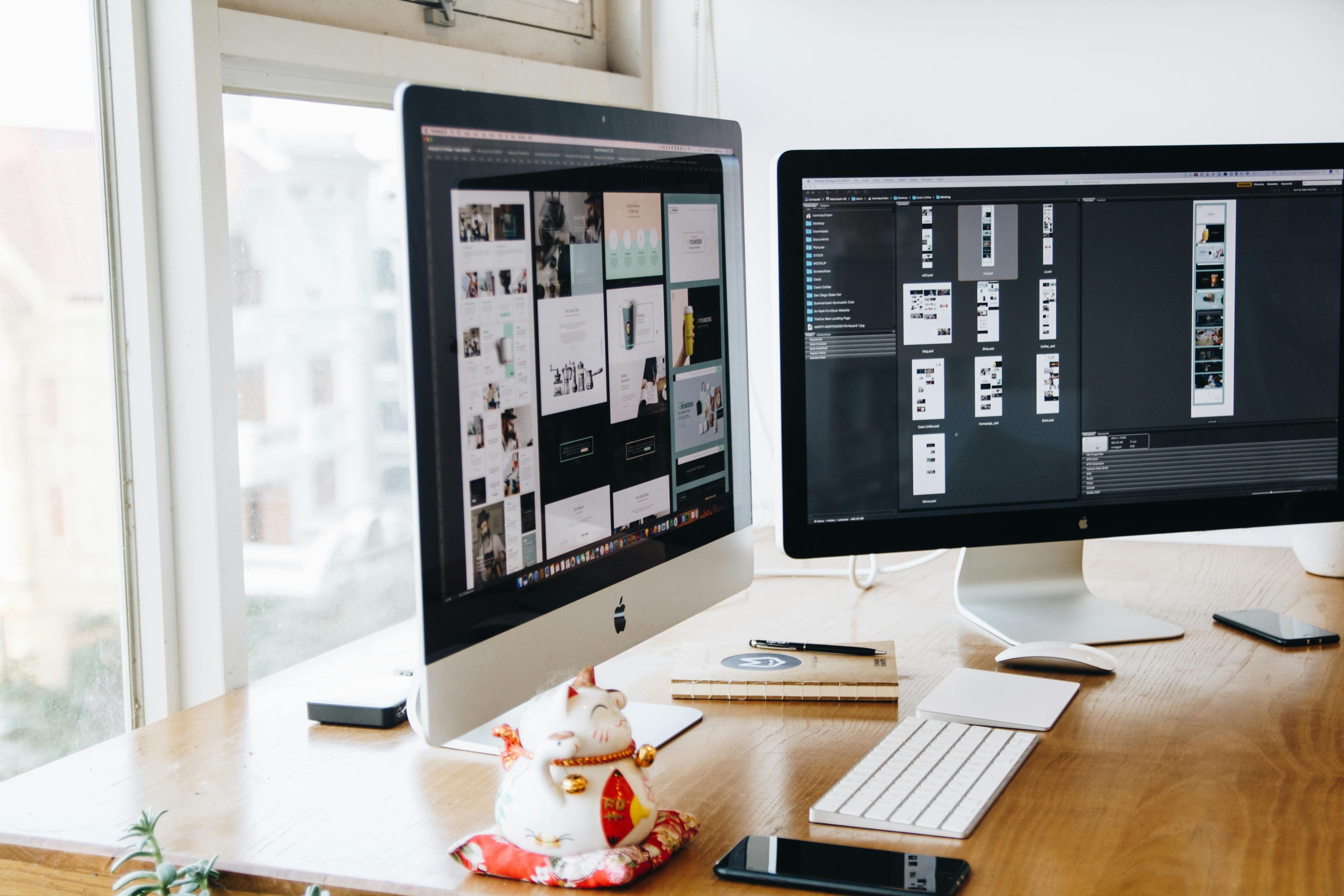
You don’t need to be a UX designer to grasp the design principles that are at the heart of UX design. As the founder of a startup, you need to understand what is driving UX, which is the experience that users have with your product. Below I will explore best practices in UX design so that you are fully capable of applying these methods and approaches to your product.
Focus on what users are seeking in a design.
This principle is about meeting users’ needs, not your own preferences for a design.
Less is more
This design principles emphasizes simplicity over clutter. A website that is cluttered, for example, will lose visitors.
Establish a hierarchy of how information is organized throughout a design.
Place the important content prominently.
Always know where you are in the design process.
Different questions need to be asked and different tools used at different stages of design.
Make your design seem “familiar” to users.
If you incorporate elements that users are accustomed to using, in general, they are more likely to accept your design faster because it will feel familiar.
Make the design as accessible to everyone as possible.
This may even mean making it accessible to people with disabilities.
Understand how the user will use the product and take their context into consideration.
Location is an example of context, as well as the type of device or whether the person is on the go.
Usability is crucial to user experience design principles.
You should only bring useful features to the user’s attention.
Provide a response
When someone clicks on something, the person expects a response from the product to prove that the command registered (human + machine interaction).
Give the user the opportunity to confirm.
People may buy something inadvertently. Before they buy it, a screen popping up to confirm the purchase would provide a better user experience because they can back out and feel relieved.
Keep the user in control.
If a user clicks on a page and wants to go back, the experience should allow to backpedal easily.
Tell a story with your design.
This principle involves balancing pace and rhythm of visual information being presented to the user.
Other things that affect the user experience are typography, visual grammar and a design’s “personality.” Following these principles will help your UX design, but there is flexibility.
You should focus on the user and let the user’s needs guide the design, so there may be times when you may “break” a design principle, but there has to be a good reason for it based on user need and acceptance.
UX design is a professional field with specially trained people who work in it day in and day out. If you are not a UX expert yourself, you will need someone either on your team or an outside resource to guide the develop the user experience that your product will deliver to customers.
Example
Below is an example of good UX design. You’ll likely recognize it from mobile apps. This UX firmly demonstrates that the user is in control, and if the user makes an error, the user can easily navigate out of it without having a poor experience.
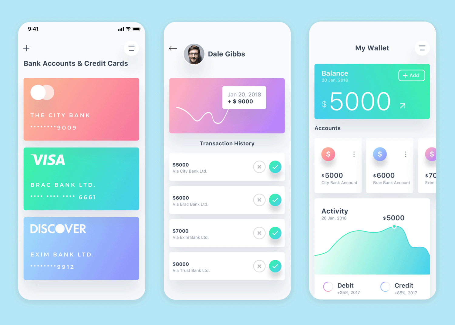
You want to make your product unique and have its own identity, but you can learn from world-class companies like Apple about UX design.
Visual Design Principles
Visual design is about bringing consistency to the aesthetics of a product. The principles of visual design guide the development of the way a website or app looks, for example. Any product can be analyzed and broken down into fundamental elements of visual design. As you take your idea from a concept in your mind into a real thing, you must think critically about how your visual design aligns with the value proposition of your product, its story, and purpose.

Elements of visual design – the building blocks of a product’s aesthetics – include the following:
Line
A line is the simplest form of visual design, and it can convey an emotion.
Shape
A shape is a self-contained entity made up of lines, textures and colors.
Negative/White Space
This is the empty space around a (positive) shape. When a positive shape is being designed, negative space is being designed at the same time.
Volume
Volume refers to three-dimensional object: length, width and depth.
Value
Value is light and dark. For example, a design with high contrast conveys more of a sense of clarity.
Color
Color is an element of light.
Texture
Texture is the surface quality of a design.

Now that you know the building blocks, let’s look at best practices:
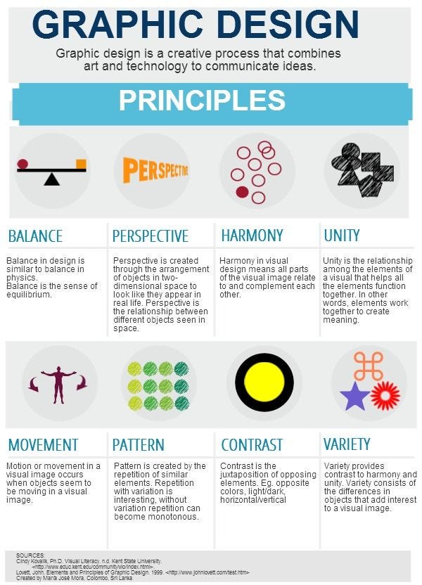
Unity
It is best to have all of the elements be in harmony with one another.
Hierarchy
It is easier for the user if you show the difference between what is important first.
Balance
This involves distributing the visual elements evenly to give a sense of calm and balance.
Contrast
Contrast is used to make an element stand out.
When you are working with visual design professionals (if you are not one yourself), keeping these principles in mind will help you ensure that your company’s visual design is clear, clean and compelling. Often, the most effective work comes back to doing the basics well.
Here is a useful guide created by Paper Leaf: Principles of Design Quick Reference Poster
Common Design Mistakes
In visual design, mistakes tend to come from failure to be simple, clear, self-disciplined and user experience-centric. Even the best can make mistakes once in a while due to overthinking, but it’s especially helpful for people starting out to become aware of the common mistakes that are made, so they can be avoided as much as possible.
The following are seven common design mistakes:
Clutter
Simply having too much stuff going on. The user doesn’t know where to look. The design conveys a sense of chaos, which results in making the user feel uncomfortable.
Lack of negative space (or white space)
This one is connected to the clutter. There is not enough white space. If you want to look at a company that designs with white space extremely well, check out Apple.
Failing to create contrast
Without contrast, things that should stand out tend not to stand out. There is no “story” in the visual design.
Ignore visual hierarchy
If a designer ignores the visual hierarchy, the user will subconsciously sense it and likely become confused by the design – another turn-off.
Forgetting about the medium
You could create a great design for a desktop computer, but when it is viewed on a smartphone, the design is jumbled. This will not work in our mobile-first world today.
Not choosing the right color combinations
If the color combinations don’t make sense or provoke a harsh reaction, there is no question that it’s a mistake.
Poor readability and too much text
If the experience of reading the words embedded in the design is poor because of bad readability and/or too much text, the design itself will not be viewed favorably.
When you are working with your design team / resource in the future, you can keep these mistakes in mind, as you evaluate options. Then you can avoid making the same mistakes.
That’s it. If you enjoying it and get some insights and want more just subscribe below.